Code and Data
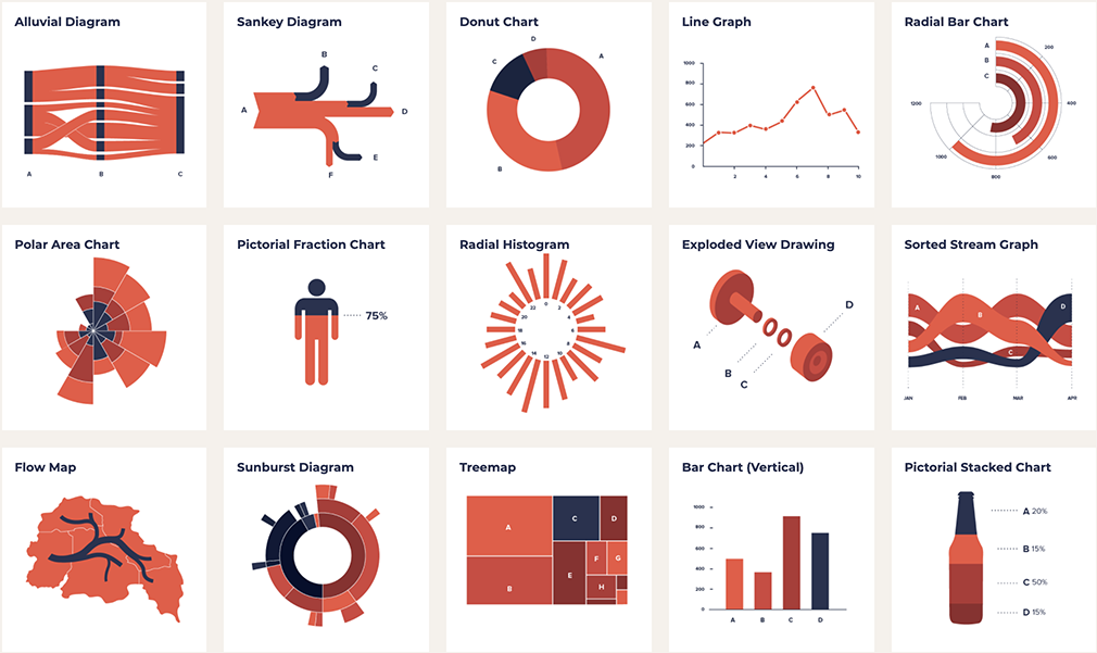
Code and Data looks at different types of data and graphs. A numeric data set is formatted first and then displayed through code. Three types of graphs are addressed here: Line, Bar and Donut graph.
3 Graphs
The advantages and disadvantages of each perspective graph were discussed and we found out that certain graphs are more suitable for certain things than other graphs.
Line
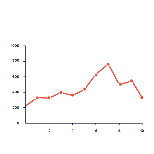
A line graph is suitable for a quick analysis that allows viewers to tell the minimum and maximum of the provided data quickly. It gives a straightforward observation of changes such as growth or decline over a given period. However, its limitations relate to the size and range of data values and are not suitable for comparing multiple categories of data at one time for a single variable. Hence, too much data might make the graph too cluttered and messy.
Bar
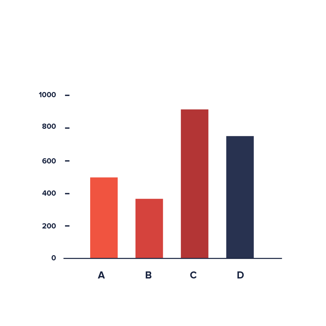
On the other hand, a bar graph allows viewers to make easy visual comparisons and is best used to track changes over time. It can easily show more than two sets of data across different categories (e.g. double bar graph) but is limited to discrete data.
Donut
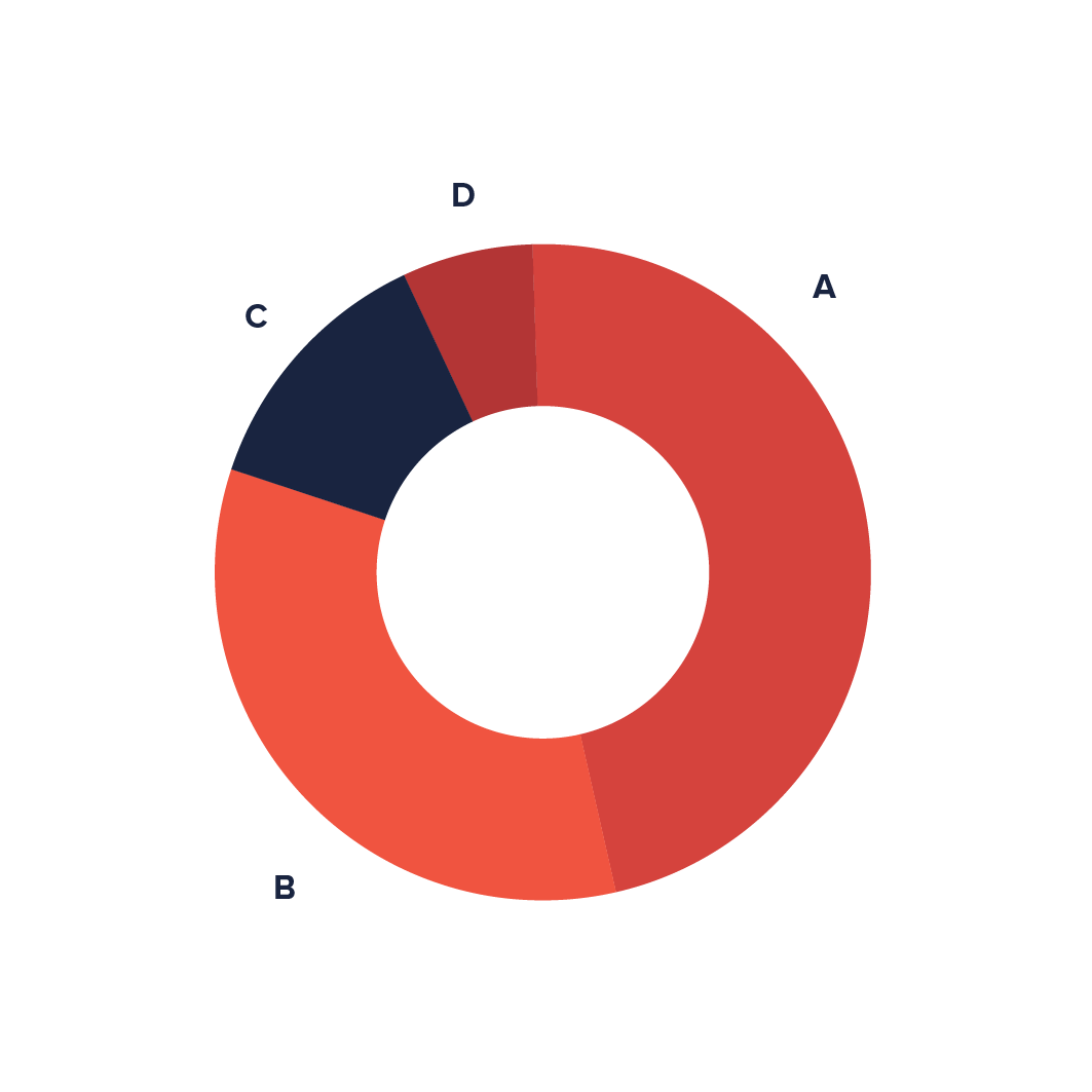
A donut chart provides a better visual distinction between each data and depicts defined data segregation that finely translates a data set. It can visualize multiple statistics at once and is more space-efficient than pie charts.
However, the data represented is limited to a circle, and it is hard to determine the size or length of arcs. Hence, drawing data from the visual analysis can cause errors. Similarly, if there are too many slices or arcs in the donut graph, it becomes more messy and difficult to read or understand.

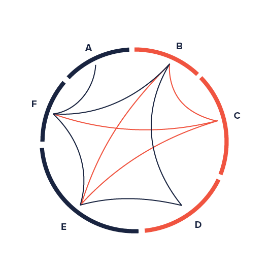
Chord diagrams are used to express the relationship between several data variables through flows, with the width of the ribbons representing the significance of the relationship.
In these diagrams, the data are arranged radially in the circumference of a circle.
The regular chord diagram (right) provides a visual contrast but the non-ribbon version provides a more intricate visual description.
Non-ribbon chord diagrams (left) share a similar concept but only show the connection lines of the variables. Lastly, this type of graph looks aesthetically pleasing and organised for small data sets.
Your Data Graph
For this exercise, we utilized p5js to create a doughnut graph to visually represent data on the top ten performing countries from the 2020 Tokyo Olympics.

As seen from the graph, we can conclude that the United States is the best-performing country based on the number of medals accumulated compared to the other countries.
The gradient shows the number of medals, with the darkest shade being the least amount and the lightest shade representing the highest amount. Below you can see the data set we used for this graph.
| Country | Number of medals |
|---|---|
| United States | 39 |
| China | 38 |
| Japan | 27 |
| Great Britain | 22 |
| ROC | 20 |
| Australia | 17 |
| Netherlands | 10 |
| France | 10 |
| Germany | 10 |
| Italy | 10 |
Data Interpretation
Since our topic is based on the Olympics, we wanted to incorporate the famous Olympic Rings to create a looping random pattern. It was a simple and playful attempt as we kept the colors and strokes of the Olympic Rings. We added different sizes of the rings, from small, medium to big to fill up the white background. The final sketch and result resembles the vibrant energy and constant movement of the Olympics athletics.
